
How to write a one-page photo style guide for your brand
A one-page set of rules for background, props, angles and editing so every product photo looks like it belongs to the same shop.
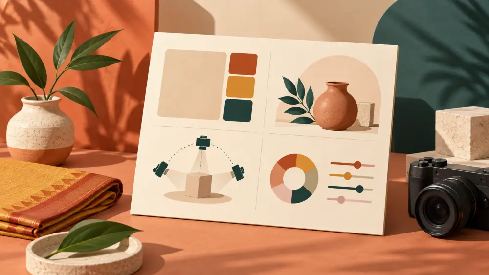
If you shoot your own products, you will notice something after a few weeks. The first batch was on a white sheet near the window, the second on a wooden table in the evening, the third with a filter you liked that day. Each photo is fine on its own, but together the catalogue looks like it belongs to three different shops. A one-page photo style guide fixes this. It is simply a short note to your future self (or to a helper) saying how your photos are made.
Why one page is enough
You are not building a corporate brand book. You are a small seller who wants the next shoot to match the last one. If the guide is longer than one page, you will not read it before shooting, and then it is useless. Write it in your notes app or on paper, and keep a printout near your shooting spot.
The five things to decide
Background. Pick one or two backgrounds and write them down. For example: "plain white chart paper for main images, one wooden board for lifestyle images." Our guide on what background colour works best can help you choose.
Props. Decide what is allowed in the frame. Maybe only dried flowers and linen, maybe nothing at all for the main image. Write a short "never" list too, such as "no branded items from other companies, no cluttered desk."
Angles. List the shots every product gets, in order: front, back, side, detail, in use. Our post on which angles to shoot for every product gives a starting set. Writing the order down means you stop forgetting the back view.
Light. Note where you shoot and at what time of day. "Next to the north window, between late morning and early afternoon, reflector on the left." This single line saves a lot of re-learning. See using window light for the basics.
Editing. This is where most inconsistency creeps in. Write the exact steps: crop to a square with the product centred, raise brightness a little, no heavy filter, keep colours true to the real product. If you use a free editing app, note the name of the preset or the sliders you moved.
Add a small reference set
Pick three of your best photos and save them in a folder called "this is the look." When you are unsure, compare the new shot against these. A visual reference does more than a paragraph of description.
An example you can copy
Here is what a finished page might say for a small candle brand:
- Background: off-white sheet, matte, no wrinkles.
- Props: one dried flower stem at most, never more than two objects besides the candle.
- Angles: front, top, lit flame, size against a hand.
- Light: window on the left, white card on the right.
- Editing: square crop, slight brightness lift, no filters, check colour against the real candle.
That is the whole guide. It took five minutes to write and it will quietly shape every shoot afterwards.
Keep it honest and flexible
A style guide is not a promise that your photos will sell better. It is a tool for consistency, and consistency mostly makes your store look tidy and deliberate. Review the page every few months. If you find a better background or a new prop that suits you, update the page and, if you want, reshoot older products to match.
Before you upload
When your photos match the guide, the upload step is easy because you are not making design decisions in the middle of it. Run through a quick pre-upload checklist and you are done. Your style guide stays in the drawer, ready for the next batch.