
What background colour works best for product photos?
The best background is the one that separates your product from its surroundings. How to choose by contrast, not by rule.
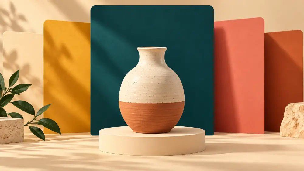
There is no single best background colour. The right question is "what makes my product stand out clearly?" The answer depends on the product, and the principle is contrast.
Think in contrast
Your background should differ from your product in both colour and brightness. A dark product on a light background shows its shape. A light product on a dark background does the same. Problems start when product and background are similar: a beige bag on a cream sheet, a white mug on white paper.
Some practical pairings
- Light or white products, such as a white mug or cream kurta: try a soft grey, a pale colour or a darker neutral.
- Dark products, such as black jewellery or a dark bag: a light grey or white backdrop works well.
- Brightly coloured products: neutral backdrops such as white, grey or beige let the colour speak.
- Natural or earthy products, such as wooden items or tea: warm neutrals, linen or plain wood surfaces suit them.
- Metallic products: avoid backdrops that reflect strongly. See photographing steel and metal utensils.
Keep it plain
Patterns, prints and busy textures fight the product for attention. Choose plain, matte surfaces. Chart paper, a bedsheet or painted card all work.
Stay consistent
Pick one or two backgrounds for the whole store and use them across products. A catalogue where every photo has a different backdrop looks chaotic. Variety in style is better saved for lifestyle photos, while your main product photos stay uniform.
Colour accuracy matters more than mood
A coloured backdrop can cast a tint on the product, especially on shiny or light items. If your product starts looking greenish because it sits on green paper, switch to neutral. Buyers who see one colour online and receive another tend to return the item, which is expensive; the costs are discussed in returns and RTO.
I cannot promise a colour sells more
You may read claims that a certain colour increases sales. I would not rely on those. Test it yourself: compare how clearly your product reads against each backdrop, and ask a few customers or friends which picture they find clearer.
Test with a thumbnail
Shrink your photo to the size of a thumbnail on a phone screen. Can you still tell what the product is? If the outline disappears, your contrast is too low.
Start simple
If in doubt, begin with white or light grey, then change only if the product demands it. The white option is explained in making a white background at home.