
How to pick a colour palette for styled product shots
Use contrast, a limited palette and simple colour-wheel logic to choose backgrounds and props that make your product stand out.
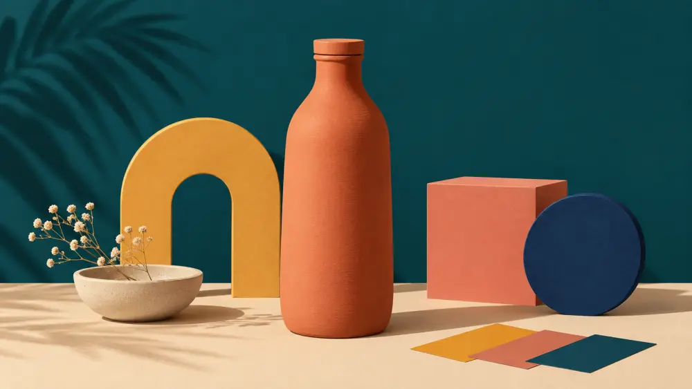
When you move beyond a plain white background and style your photos with coloured sheets, props and surfaces, colour choices start to matter. Pick badly and the product blends into the background or clashes with everything around it. You do not need art school to get this right. A few simple rules go a long way.
Start from the product's own colour
Look at the main colour of your product. That is the anchor. Every other colour in the frame should be chosen in relation to it. Hold a few sheets of paper or cloth behind the product and look at the options through your phone screen, because the camera sees things differently from your eye.
Use a small palette
A calm styled photo usually has two or three colours:
- The product's colour.
- A background colour.
- One accent, if any.
Neutral tones such as white, cream, grey, beige and wood count as quiet extras and do not need counting against this limit. The more colours you add, the busier the picture feels and the harder it is for the product to hold attention.
Colour wheel logic in plain words
Picture the colour wheel, with colours arranged in a circle.
- Opposite colours (complementary), such as blue and orange, create strong contrast. A blue bottle on a warm sand background pops.
- Neighbouring colours (analogous), such as green, teal and blue, feel calm and harmonious. A green plant pot on a soft sage background looks gentle, though the product can fade into the backdrop, so check contrast.
- Neutral backgrounds work with nearly everything and are the safest choice when you are unsure.
You do not have to follow these rules strictly. They are a starting point for experiments.
Check contrast, not just colour
Colours can be different and still look alike once the photo is in black and white. A pale pink product on a pale grey sheet may disappear. Try turning the photo to greyscale on your phone. If the product still stands apart from the background, the contrast is good. If not, go lighter or darker with the backdrop.
Mind the colour of the light
A coloured background reflects onto the product, especially shiny or white items. A bright red sheet can tint a white mug pink at the edges. Use a reflector or move the product slightly away from the backdrop. Also keep one type of light in the frame; mixing warm and cool bulbs shifts colours unpredictably. See using cheap LED lights.
Be honest about the product's colour
Styling should never change how the product looks. After editing, compare the photo against the real item. If the colour in the photo is noticeably different, customers may feel misled. Read describing colour accurately online for how to word it when photos cannot match perfectly.
Pick a house palette
Once you find combinations you like, write them down: two or three backgrounds and a few accent colours that suit your brand. Add them to your photo style guide so every shoot starts from the same set. Props in matching tones are covered in how to choose props.
Try, look, adjust
Colour choices are easiest to judge visually. Take a test shot with each background, line them up on your phone and pick the one where the product is clearly the star. Trust the shot, not the theory.