
How to describe colour accurately when screens show it differently
Practical ways to name colours, add reference objects and set expectations about screen variation, so fewer buyers are surprised by what arrives.
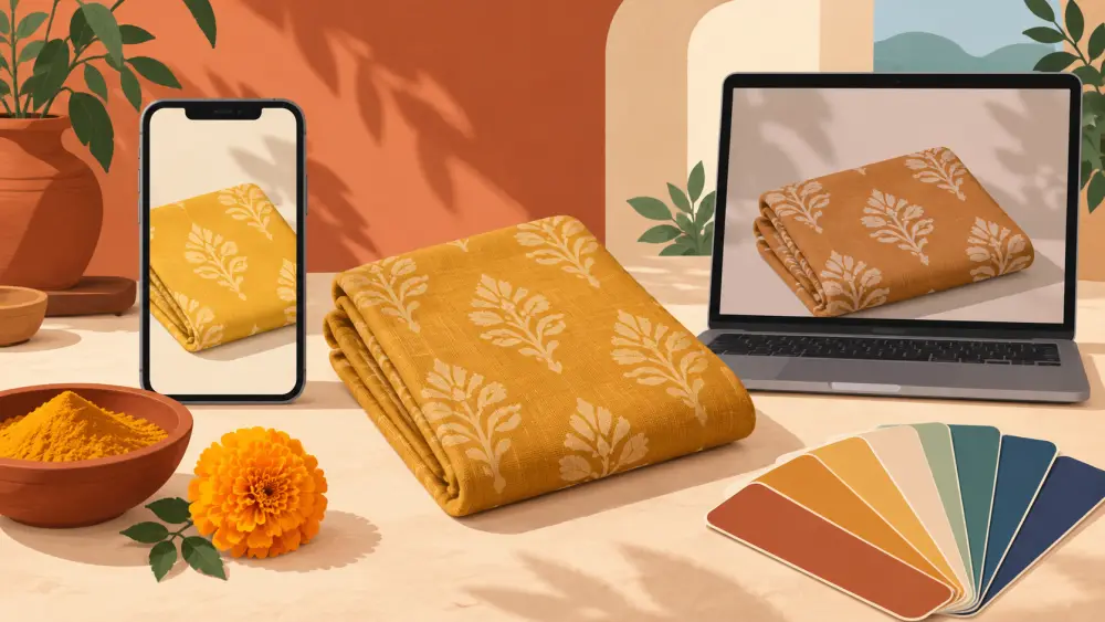
You photograph a dusty rose kurta in good light. On your phone it looks soft and pink. On a customer's older phone it looks closer to orange, and on a laptop it looks grey. Nobody did anything wrong: screens simply show colour differently. No photo setup removes this entirely, so the aim is to narrow the gap and be honest about what remains.
Use a colour name that means something
"Beautiful shade" says nothing. "Dusty rose with a slight grey undertone" tells the buyer where to look. Use common, concrete names:
- Everyday references: mustard, rust, teal, mint, charcoal.
- Food or nature comparisons: turmeric yellow, bottle green, sand.
- Two-part names for in-between shades: warm beige, cool grey.
Pick one name per colour and use it everywhere: in the description, in captions and in chats. If a customer says "the olive one" and your listing says "moss", you will spend time clearing it up.
Add a reference object
A colour is easier to judge next to something familiar. Show the product on a plain white or neutral surface, or beside an everyday object such as a steel tumbler or a wooden table. For clothing, a photo on a person tells more than a flat-lay alone. Good basic photography helps; photographing products on a phone covers how to get consistent light.
Show more than one photo in different light
A daylight shot near a window and a closer detail shot give a better sense than one filtered image. If a colour changes noticeably between indoor and outdoor light, say so. On a Varchas store, each colourway can carry its own extra photos, and when none are added it falls back to the product gallery. Add real shots for each colour instead of re-using one image with an edit.
Do not over-edit
Heavy filters, saturation boosts and brightness changes make the problem worse. The goal is for the photo to look like the product, not like the best version of it. If you edit, keep it to light adjustments to match what you see in person.
Write a simple screen note
A short sentence in the description sets honest expectations: "Colours may look slightly different on your screen depending on your display settings." This is a courtesy, not a loophole. Use it alongside accurate photos, not in place of them.
Name colours consistently in your colourways
When you set up variants, the colour name is what the shopper sees when they choose. In the Varchas product editor, each colourway has a name and a swatch colour, so the swatch and the name should agree. Keep names short and clear, and see how to name colour and size variant options clearly.
Offer help when someone is unsure
If a customer is unsure about a colour, answer with a real photo taken in daylight on request. Keep a few such pictures ready. For some buyers, seeing the real item next to a coin or a ruler settles the question faster than another description.
Why it matters
Colour is one of the most common reasons for a disappointed buyer, and it can lead to a return. Careful naming and honest photos reduce the surprise, which is part of the story in returns and RTO: the numbers nobody tells you.