
How to name colour and size variant options clearly
Consistent, unambiguous labels for colour and size options, and why vague names such as free size cause confusion at checkout.
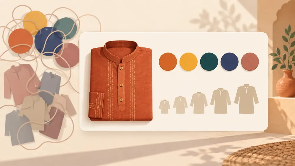
The names you give to colours and sizes are the words a shopper clicks on at the moment of decision. If they are unclear, the customer either guesses wrong or sends you a message. Clear names remove that friction.
Name colours in words people use
Choose short, common names, and use the same name everywhere:
- Good: Olive, Sand, Black, Rust, Navy
- Risky: Mystic Moss, Desert Dream, Shade 3
Fancy names can be charming, but only if the shopper can still tell what the colour looks like. If you love a poetic name, pair it with a plain one: "Rust (Terracotta)". For help describing shades honestly, read describing colour accurately online.
Match the name to the swatch
In the Varchas product editor, each colourway has a name and a swatch colour, with hex values accepted in a few formats. The swatch the customer sees should match the name. A swatch that looks grey under the name "Sand" confuses people. Check the swatch on your phone, then fix it if it looks off.
Keep sizes as simple labels
On a Varchas store, sizes are S, M, L and XL, set per colourway. Those labels are short and familiar, but they mean different things to different brands. Say what they mean on your product, with measurements in the description, so no one has to guess. What details every product description should include covers where to put them.
Be careful with "free size"
"Free size" sounds convenient but is ambiguous: free for whom? A customer cannot tell whether it fits them. If you sell a one-size item, state its real measurements and who it suits, for example "Fits bust up to 40 inches". I am not citing any sizing standard here; use your own measurements and state them honestly.
Avoid ambiguous words
- "Regular" and "Standard": relative to what?
- "Large" for both a size and a product dimension.
- "One size fits all": rarely true, so say what range it fits.
- Names that differ between pages: "Dark Green" in one place, "Bottle" in another.
Use consistent wording across products
If you call a colour "Charcoal" on one product, do not call it "Dark Grey" on another. Consistency makes your catalogue easier to scan and your stock sheets easier to match. This is the same principle as in SKU naming convention examples if you keep a code sheet.
Write the same name in photos and text
If the label says "Olive", your photo captions and description should also say "Olive". Mismatches make people stop and wonder whether they are looking at the same item.
Be mindful of what you track
Each colourway you add needs its own stock and ideally its own photo, so only name options you can really supply. See how many variants is too many.
Read it as a customer
Open your product on a phone and read only the option names, with no photos. Could you tell what you are choosing? If not, rewrite. A few clear words at this stage reduce questions later, and the full picture of options is covered in setting up product variants properly.