
How to design a clear size chart image for mobile screens
Large text, visible units and a consistent layout turn a size chart image from a squint-and-guess puzzle into something buyers can read at a glance on a phone.
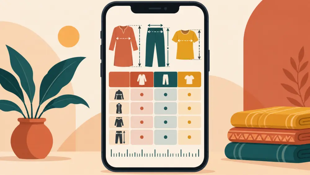
Most of your customers will see your size chart on a phone screen about the width of a palm. A chart that looked fine on your laptop turns into tiny grey smudges there. When the numbers cannot be read, the buyer guesses or messages you, or leaves. Designing a chart image for mobile is mostly about making it simpler, bigger and the same every time.
Start from the phone, not the computer
Open any image-making tool you already use, such as a free design app on your phone, and create a portrait or square canvas. Work on that canvas while viewing it at phone size. If you design large on a desktop and shrink later, you will not notice how small the text really is. Keep checking by looking at the image on an actual phone.
Use large, plain text
Choose one clean, easy-to-read font and keep it large. As a test, hold your phone at arm's length: if you cannot read the numbers, they are too small. Avoid thin decorative fonts, because their strokes vanish on small screens. Use dark text on a light background, or white on a deep solid colour, so the contrast is high. Skip patterns and photographs behind the numbers.
Show the unit clearly
Every measurement needs a unit next to it or in the heading. Write "cm" or "inches" in the column header so it is obvious. If you want to show both, make two clearly labelled charts or two labelled columns rather than writing both numbers in one cell. If you leave the unit out, a buyer will wonder whether 38 means centimetres or inches.
Label what is being measured
Add a heading that says whether the chart shows garment or body measurements, and whether the numbers are flat or full circumference. Our post on body measurements vs garment measurements in a size chart explains why this label matters so much.
Keep the layout simple and consistent
Use a tidy grid: sizes in the first column, measurement types across the top. Keep a generous row height so the lines do not crowd one another. Limit the table to what the buyer needs. Five or six columns is already a lot for a phone. If you have more measurements, split them into two charts.
Make the layout the same for every product. Same fonts, same colours, same position of the heading, same order of columns. A returning buyer will learn your chart once and read it faster each time. If your products differ, such as tops versus bottoms, give each type its own template and reuse it.
Add a small diagram if it helps
A simple line drawing of a garment with arrows and letters showing where each measurement is taken can be very clear. Mark A for chest, B for length and so on, and use the same letters in the table columns. Keep the drawing clean and large. Do not add decoration that could be confused with a measurement point. The walk-through in how to measure a garment correctly for your size chart lists the points you can use.
Export at a useful size
Export the image in a standard format and a size that stays sharp on mobile without being enormous. If it is too heavy, it loads slowly on weak networks, and if it is too small, the text blurs. Check how it looks on your phone after exporting. Our post on resizing and compressing product images for web helps you balance the two.
Do not rely on the image alone
An image cannot be read aloud by assistive tools unless you describe it, and it may fail to load on a weak connection. Type the same measurements into the product description as text. Add a short alt description for the image too, as explained in how to write alt text for product images.