
How can I make Instagram highlight covers for free?
A simple way to make matching highlight covers on your phone with free design tools, using two colours, one font and plain icons.
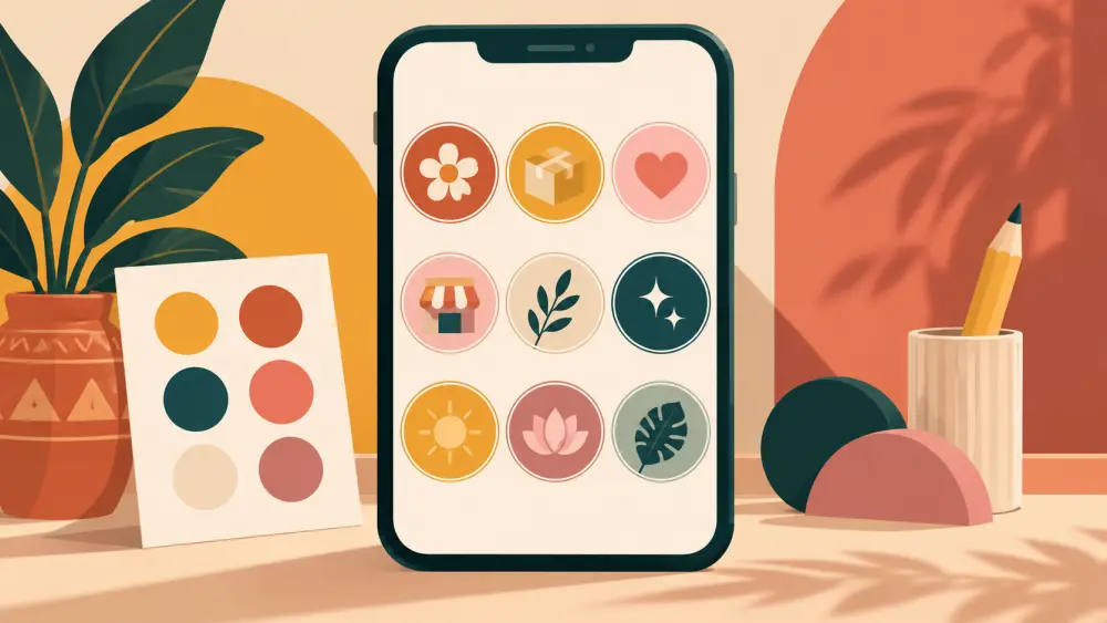
Highlight covers are the small circles under your bio. They are tiny, so they do not need to be clever. They need to look like they belong together. You can make a full set in under half an hour, on your phone, without paying for anything.
Decide the look first
Before opening any app, choose three things.
- Two colours, one for the background and one for the icon or letter. Pull them from your logo or your packaging.
- One font, bold and easy to read at small size.
- One style, either icons or single letters or short words.
Write these down. When you add a new Highlight next month, you will use the same choices.
Pick a free tool
Many free design and photo apps offer templates. I will not name specifics or promise what any of them include, because free plans change. Look for an app that lets you set a custom canvas size and export an image. Pick one you find easy and stay with it.
Set the canvas
Highlight covers are shown inside a circle, but you upload a square or tall image and then crop. Make a square canvas, such as 1080 by 1080 pixels, and put your icon in the centre with plenty of space around it. The circle crop cuts the corners, so anything near the edge may be lost.
Design one, duplicate the rest
- Make the first cover with the background colour and one icon.
- Duplicate the page.
- Swap the icon for each Highlight, such as a box for orders, a truck for delivery, a star for reviews, a question mark for FAQs.
- Keep sizes and positions identical.
Icons can be simple shapes from the app's own library, or your own drawing, or even a single bold letter. If you use something from a library, check its licence for commercial use in that app.
Test on a phone
Export all covers and upload them. Look at your profile on your own phone at arm's length. Can you read each one? If an icon is too detailed, simplify. If the colours feel loud, tone one down. Fix this before you tell anyone.
Keep the set small
Four to six covers look neat. If you are unsure which Highlights to create, read which Instagram Highlights a small shop should have first. Covers are decoration for useful content, not a replacement for it.
Match your store
If your store uses a certain colour for buttons or headings, reuse it in your covers. A consistent palette across Instagram and your store makes the brand feel like one thing. The same idea applies to photos, as discussed in how to build a simple brand photo style guide.
Common mistakes
- Using five colours and three fonts.
- Putting tiny text inside a circle.
- Choosing a cover that looks nothing like your brand because you liked a template.
- Forgetting to update covers when you rename a Highlight.
You do not need a designer for this. A calm, consistent set made on your phone looks more professional than a flashy set with no pattern. Spend your energy on the content inside the Highlights, and keep the covers quiet.