
What is a checkout page? (and what it should ask for)
The checkout page is the last step before an order, where you collect the address and payment, and every extra field you ask for is one more reason to stop.
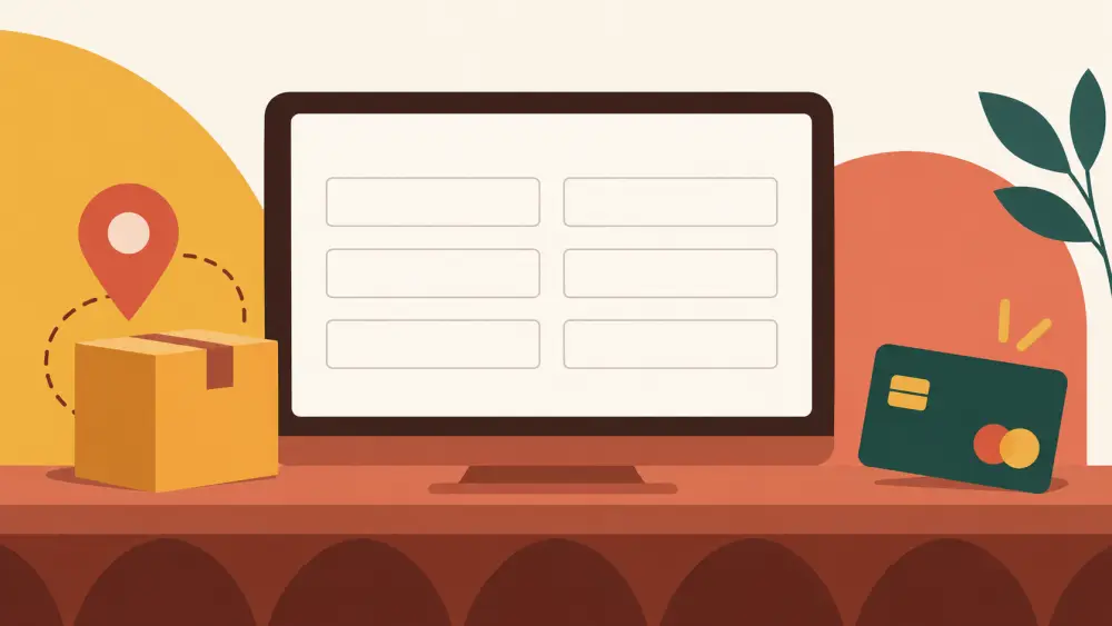
The checkout page is where a shopper turns a cart into an order. She has chosen her items. Now you need to know where to send them and how she will pay. That is its whole job, and it deserves care because it is the narrowest part of your store.
What it must collect
At minimum, a seller needs to be able to deliver and to be paid:
- Who the parcel is for
- How to reach them
- Where to deliver
- How they will pay
Everything else is optional. Ask yourself of every extra field: "Will I use this to ship, to contact, or to charge?" If the answer is no, think hard before keeping it.
A six-field example
Here is a lean set of six fields for an Indian address:
- Full name
- Mobile number
- Full address (house number, street, landmark)
- Pincode
- City
- State
Plus a payment choice. That is enough for a courier to find the door. Adding "company name," "alternate phone," "gift message" and "how did you find us" turns it into a form, and shoppers on small screens feel the extra effort.
I will not claim a percentage lift from fewer fields. I do not have evidence for a number. What I can say is that long forms are tiring on a phone, and a form with fewer boxes asks less of a hurried person. Judge it from your own results.
Fields that quietly help delivery
Not all fields are equal. A landmark helps a delivery agent in a lane with no street signs. Why landmarks help delivery agents find homes explains that. A correct pincode avoids delays, as in common pincode mistakes that delay orders. So some fields earn their place.
Payment choices
At checkout the shopper picks how to pay. In the Varchas code I found payment methods including cash on delivery, part payment with the balance on delivery, and online payment through Cashfree. The store labels them as Cash on Delivery, Advance + Cash on Delivery and Cashfree. Offering a clear choice, with a plain sentence about each, reduces confusion. COD vs prepaid, how to guide customers helps you word it.
Trust signals near the form
On the checkout page, people are most nervous. A few things calm them:
- Your return policy, linked and easy to find.
- Support contact details.
- A clear order summary with the total, including shipping, before they pay.
- No surprises. Never add a charge that the cart did not show.
What to avoid
- Forcing account creation before buying, if you can avoid it.
- Hiding shipping costs until the last moment.
- Asking for the same thing twice.
- Vague error messages when something is wrong.
Next step
Place a test order on your own store from your phone, with a stopwatch. Count the fields and the seconds. Then remove anything you did not use on your last ten orders.